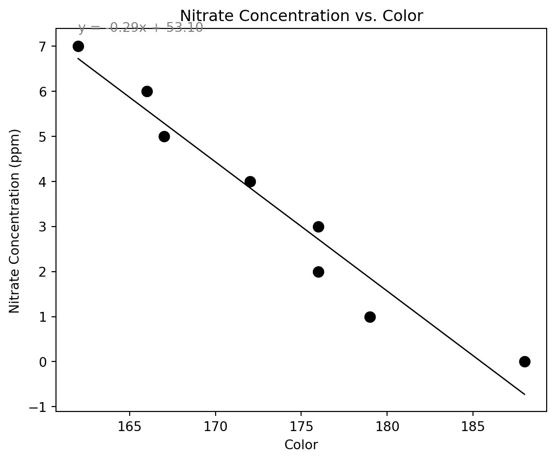
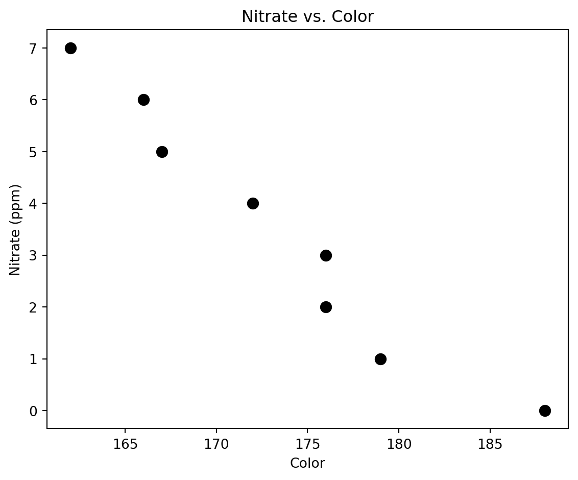
[188, 179, 176, 176, 172, 167, 166, 162]
[0, 1, 2, 3, 4, 5, 6, 7]Workshop #3
Regression & Prediction
Remember Me, Smokey Buoy!?
We met Smokey Buoy last workshop and learned a bit about how it works.
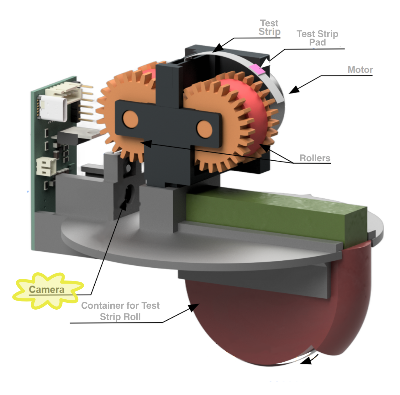
Smokey Buoy: Components
Let’s recall Smokey’s components and how they work together
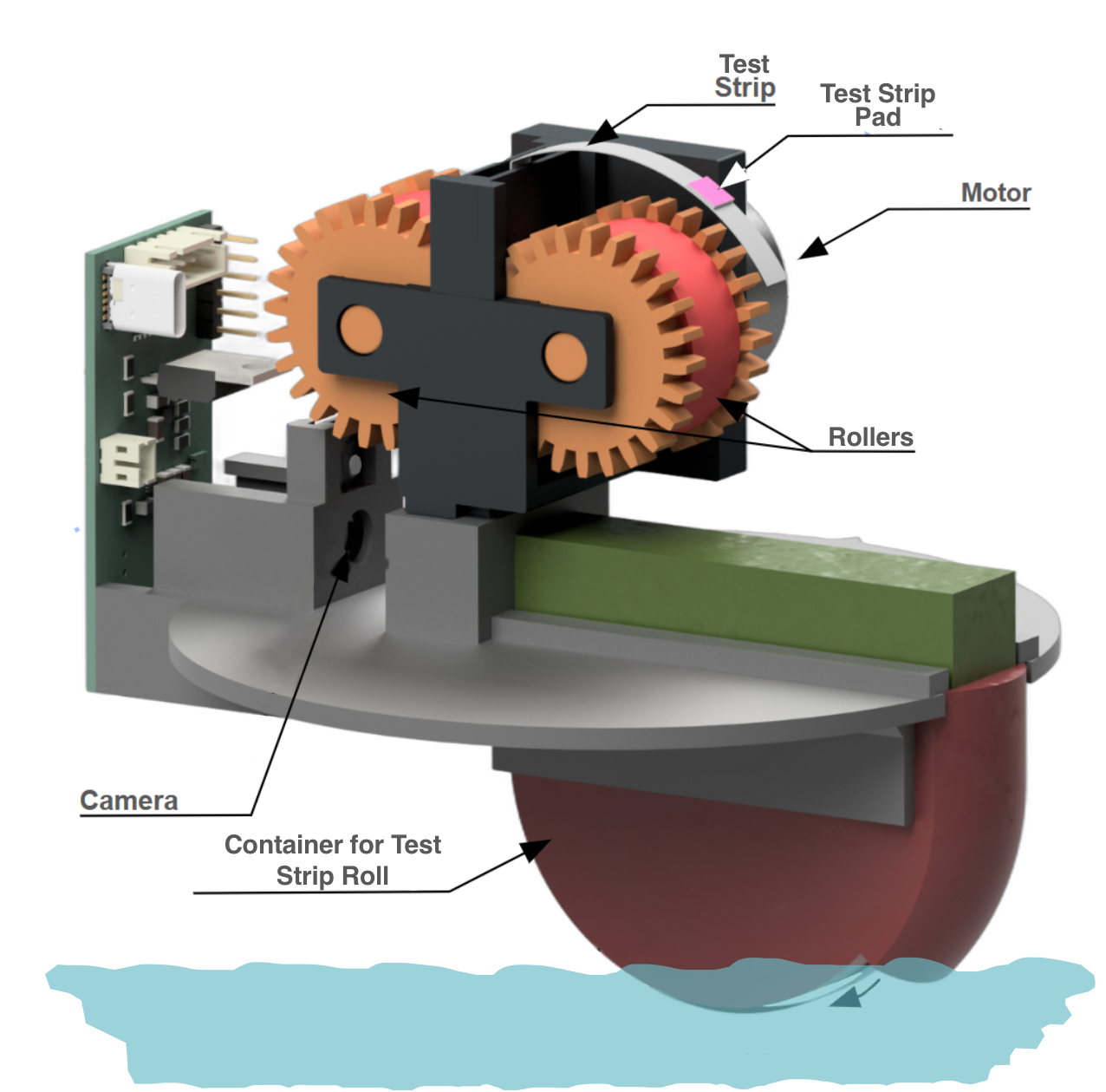
Smokey Buoy: 🎥 Camera
Smokey Buoy’s camera has two jobs:
- Watch for a test pad
- We talked about this last workshop!
- Recall: What is the process called?
- When pad is present, take a picture
- We’ll discuss what happens with the picture today!
- A new process!
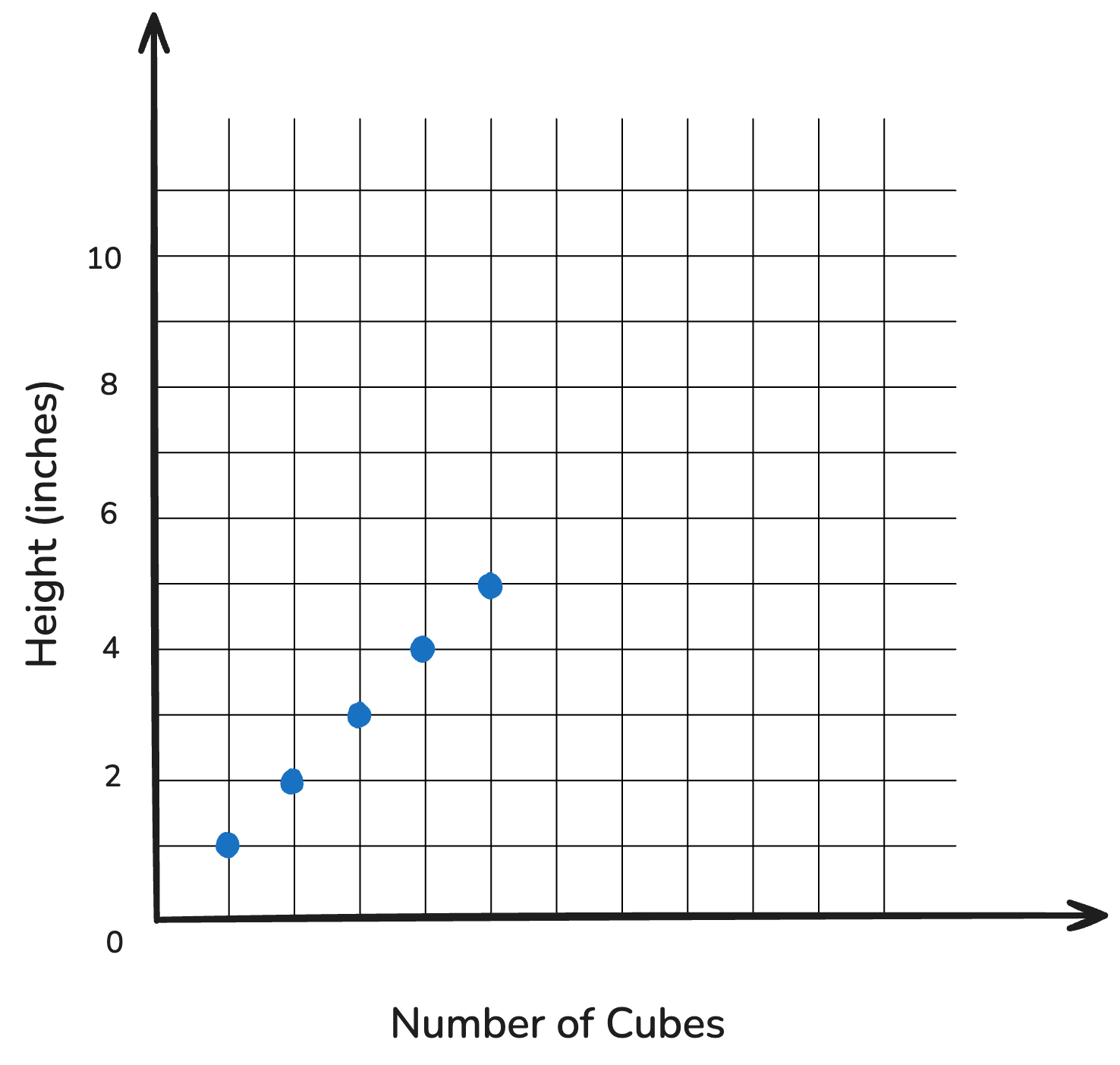
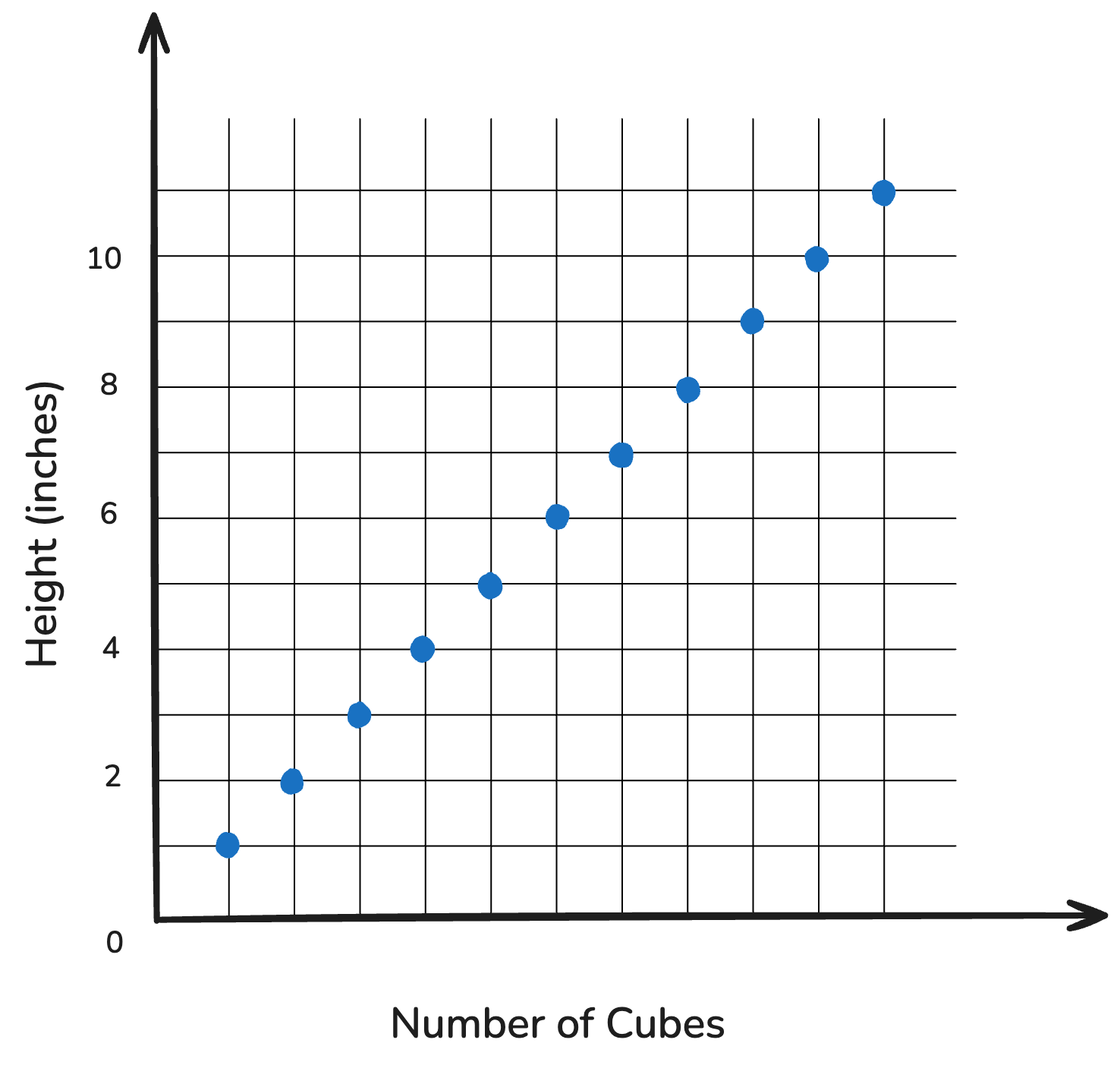
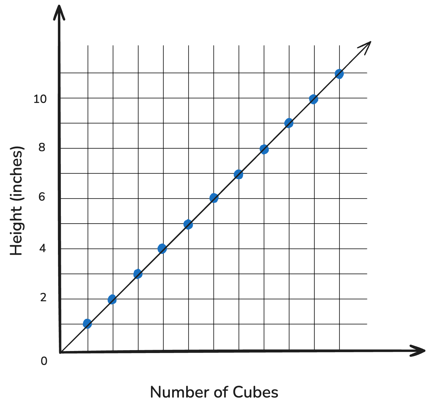
Scenario 1: Cube Towers
- We want to build a tower
- We have 1” inch cubes to use

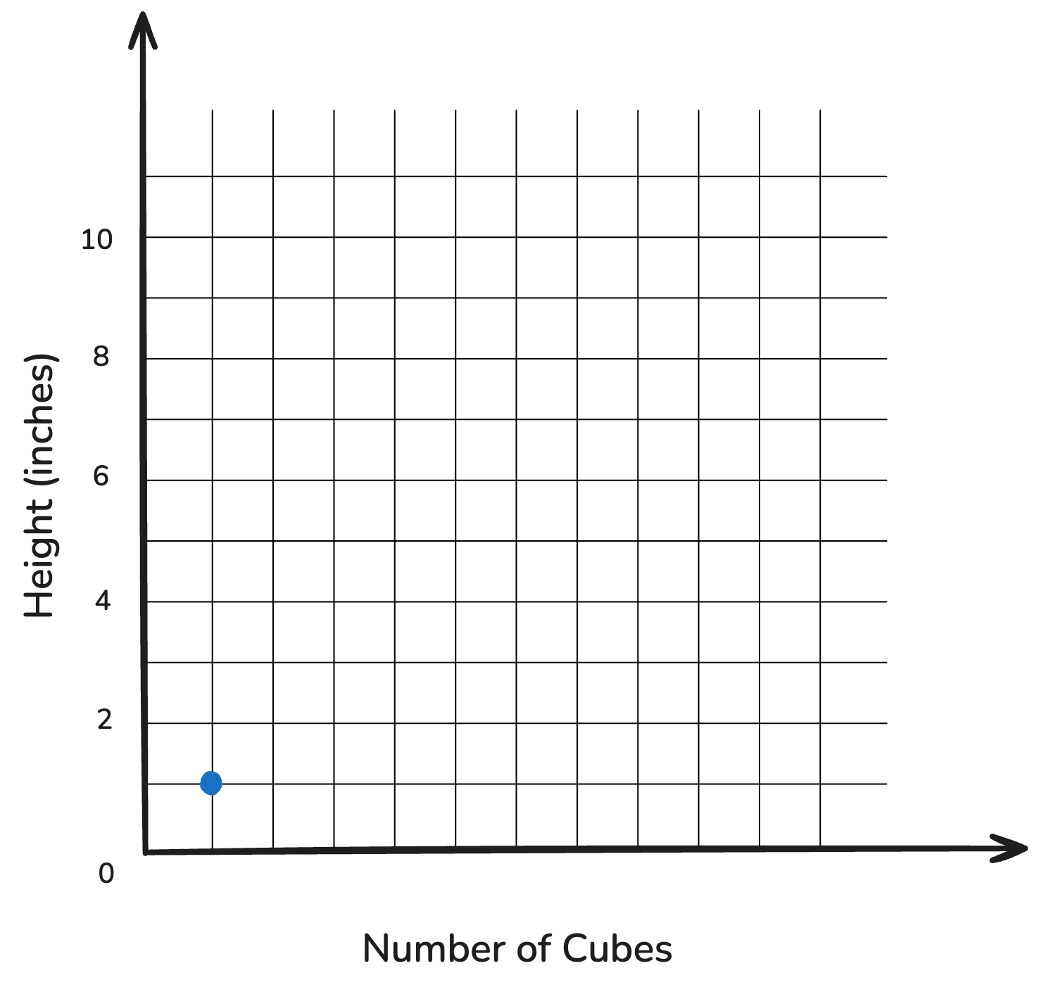
📝 Let’s Predict! — 1 Cube
| # of Cubes | Height (inches) |
|---|---|
| 1 | 1 |
📝 Let’s Predict! — 2 Cubes
| # of Cubes | Height (inches) |
|---|---|
| 1 | 1 |
| 2 |
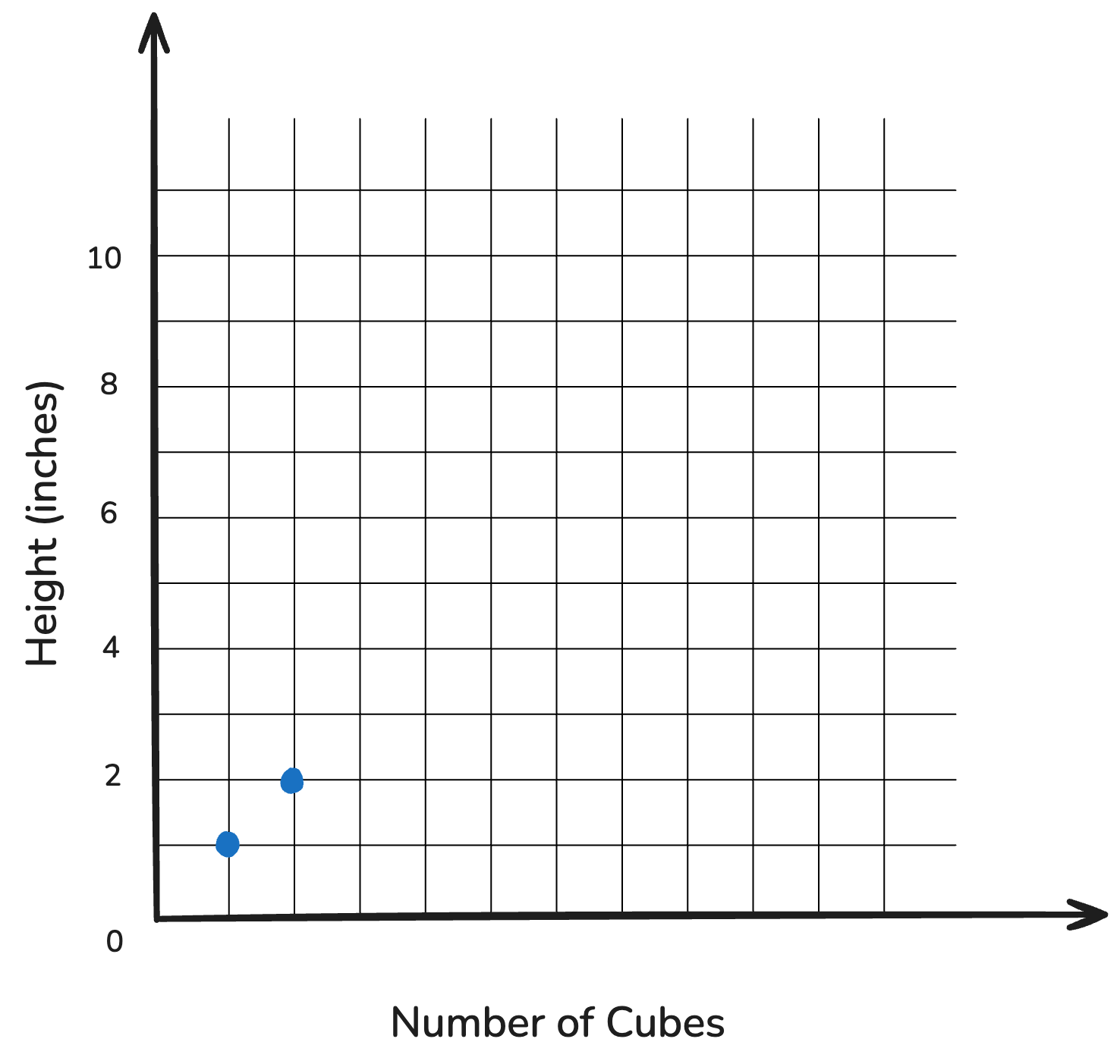
📝 Let’s Predict! — 2 Cubes
| # of Cubes | Height (inches) |
|---|---|
| 1 | 1 |
| 2 | 2 |
📝 Let’s Predict! — 3 Cubes
| # of Cubes | Height (inches) |
|---|---|
| 1 | 1 |
| 2 | 2 |
| 3 |
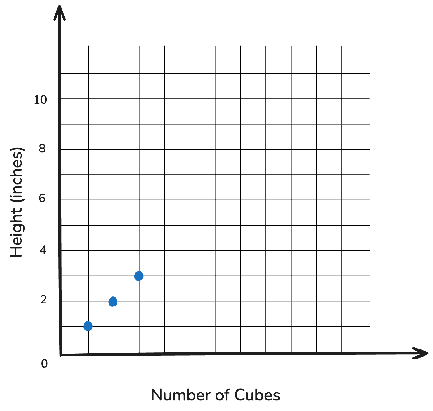
📝 Let’s Predict! — 3 Cubes
| # of Cubes | Height (inches) |
|---|---|
| 1 | 1 |
| 2 | 2 |
| 3 | 3 |
📝 Let’s Predict! — 4 Cubes
| # of Cubes | Height (inches) |
|---|---|
| 1 | 1 |
| 2 | 2 |
| 3 | 3 |
| 4 |
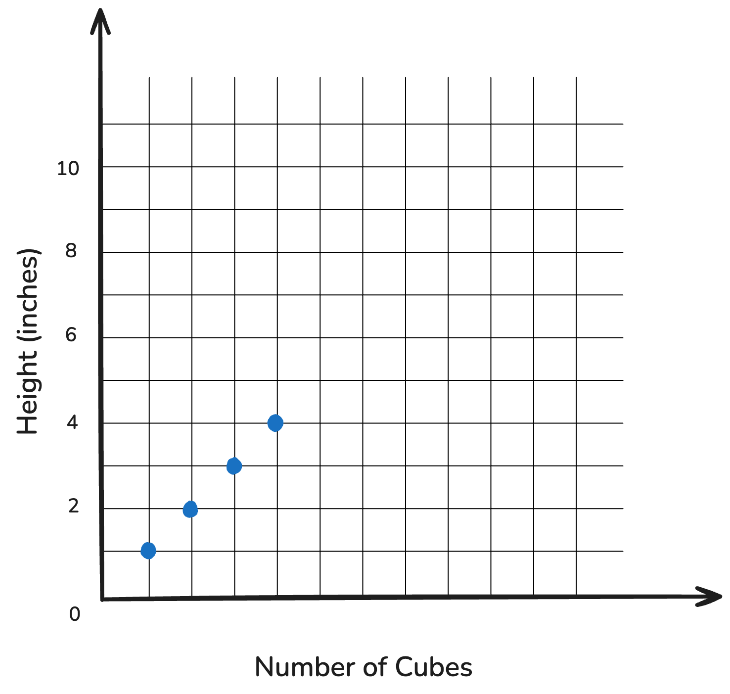
📝 Let’s Predict! — 4 Cubes
| # of Cubes | Height (inches) |
|---|---|
| 1 | 1 |
| 2 | 2 |
| 3 | 3 |
| 4 | 4 |
📝 Let’s Predict! — 5 Cubes
| # of Cubes | Height (inches) |
|---|---|
| 1 | 1 |
| 2 | 2 |
| 3 | 3 |
| 4 | 4 |
| 5 |
📝 Let’s Predict! — 5 Cubes
| # of Cubes | Height (inches) |
|---|---|
| 1 | 1 |
| 2 | 2 |
| 3 | 3 |
| 4 | 4 |
| 5 | 5 |
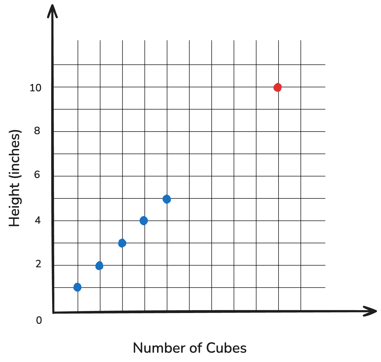
📝 Let’s Predict! — 10 Cubes
| # of Cubes | Height (inches) |
|---|---|
| 1 | 1 |
| 2 | 2 |
| 3 | 3 |
| 4 | 4 |
| 5 | 5 |
| 10 |
📝 Let’s Predict! — 10 Cubes
| # of Cubes | Height (inches) |
|---|---|
| 1 | 1 |
| 2 | 2 |
| 3 | 3 |
| 4 | 4 |
| 5 | 5 |
| 10 | 10 |
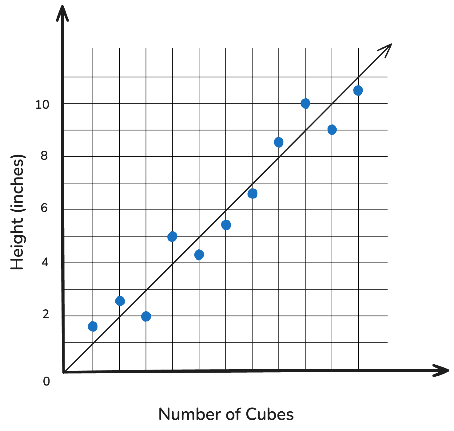
Scenario 2: Cheap Uncle Bob
Oh no! Uncle Bob’s cubes are all slightly different heights!

The Case for Regression
The Case for Regression
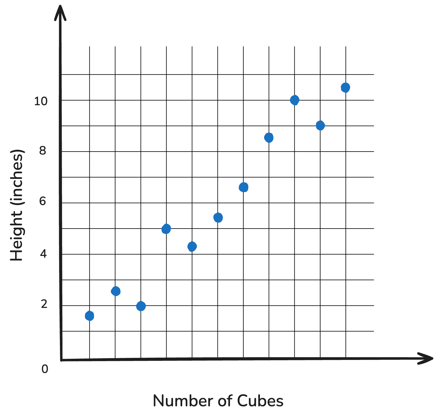
Bob’s cubes saved us money, but now tower heights are all over the place.
We need a better way to predict.
How Do We Fit Our Line?
Averaging RGB
In Workshop #2, we learned how computers “see” color through RGB values. The buoy takes all the pixels for each test pad and finds their mean.
![]()
Averaging RGB
In Workshop #2, we learned how computers “see” color through RGB values. The buoy takes all the pixels for each test pad and finds their mean.
![]()
![]()
Averaging RGB
In our applet (for the next activity), we split the pixels into a grid and meaned each section. We will treat the center box like the test pad (use that number).
![]()
Averaging RGB
In our applet (for the next activity), we split the pixels into a grid and meaned each section. We will treat the center box like the test pad (use that number).
![]()
![]()
Averaging RGB
In our applet (for the next activity), we split the pixels into a grid and meaned each section. We will treat the center box like the test pad (use that number).
![]()
![]()
![]()
Averaging RGB
In our applet (for the next activity), we split the pixels into a grid and meaned each section. We will treat the center box like the test pad (use that number).
![]()
![]()
![]()
![]()
Recreating Your Team’s Scatterplot
Plotting the Regression Line